Yesterday I had written about a small feature available in AdSense Ads, that is, having a Google Checkout symbol in the Ad. And today as I published “Google Guide for Bloggers” article, I could see some widgets like ads in my AdSense Ad units. And when I placed my mouse pointer over the link of the Ad, I got the following URL in my status bar..
javascript:_ADS_ReportInteractionClick(‘http://www.viator.com/Rome/Vatican-and-Sistine-Chapel/tours-activities/d511-ttd-spoi?pref=02&aid=gc3594′,’destination_url_1’)
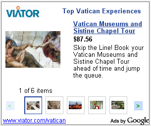
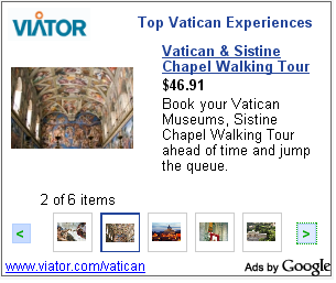
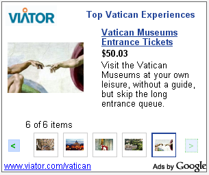
Here are some screen shots of the Ad…

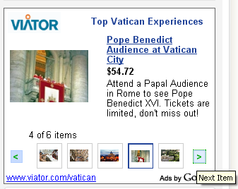
When we take our mouse over the arrow mark, a message “Next item” comes. This can be seen in below screen shots.


Above are the screen shots showing all the 6 Ads present in that single Ad Unit.
Loading time of this page is more, as I have put .png files without optimizing it. I wanted to keep up the quality of those image.
These ads are similar to those of ebay ads. But the scrolling of ads brings more interactiveness for the Advertisements. And these ads look more clean and interesting and more importantly, they load faster, unlike ebay, widgetbucks, amazon etc ads.
I had heard of Google testing this Ad format, but had not seen it live before. It was nice to see this kind of new ad format on my own blog today. Anyway, I wish Best-of-luck to Google, with its testing.

WOW this Google Ads Seems to be more eye caching.i will definitely opt for this ads if its available from Google Adsense Login .
I am seeing these ads at this time too. Great!!
~Sahil
@Blogsdna, @TechnoDiary, Ya its more eye caching. And to my wonder I am able to see these ads even now on my blog. This post was done on Jul.25, 2008 and today is Feb.12, 2009, and its still the same ads. Cheers 🙂
It’s nice see the ads now also ….Good luck dude!!!